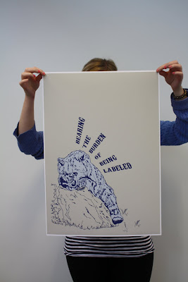
Overall I am pretty happy with the finished poster I am created, although the design is simple, the message itself is playful and light hearted, which is what I wanted to achieved. I've looked at previous posetr designs from Don't Panic and found that mnay of them were really promicuious and a lot of the time I dont nderstand them.
I really enjoyed this project as we were given a direct problem which we had to come up with a visual resolution for it which is what I did. There were some constraints to it , size, format etc which I also really liked. The project was short and we only had a week to do it. I feel, I could have perfected the final poster design more if we had more time but as I have learnt, TIME is a massive factor in Graphic Design Practice and I am happy with what I've made in the amount of time given
I used both type and image for this poster and I found it hard at first to link the two together interms of layout. I think that this is something that I would like to learn more of in ther future....using type and image.
I also would like to have worked more on the other two posters although they werent as strong as the first one visually but i still like the message within them and i think, with more time put into them, the three would work well as a set

No comments:
Post a Comment